Client Products
Catalogue filters: from browsing to relevant products
Category navigation, quick filters and detailed selectors for a white-label commerce app.
Problem and context
In 2025, I designed catalogue navigation and filtering for a white-label commerce app. Shoppers needed to narrow large product ranges, while different categories required different selection criteria.
The challenge was to support detailed choices without making the catalogue harder to browse. Common controls needed to stay within reach, with room for more specific attributes when a shopper needed them.
+4% add-to-cart conversion — relative uplift in an A/B test
My role
I designed category navigation, quick and full filtering, selectors and sorting, including selection states and how applied choices appear alongside the results.
Start with category navigation
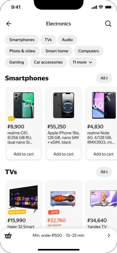
The journey starts in the catalogue: shoppers open a category and see its products alongside the available ways to refine them. Category navigation establishes the scope before individual attributes are selected. Filtering remains part of browsing, allowing a gradual move from a broad product range to a more specific selection.
Quick choices with room for detail
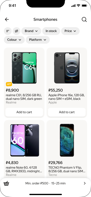
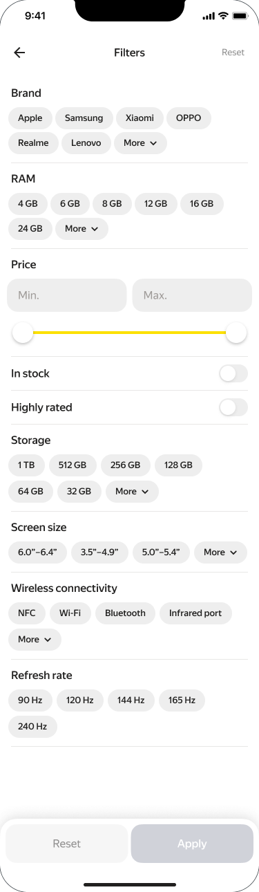
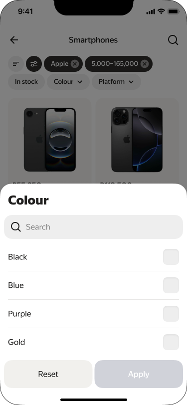
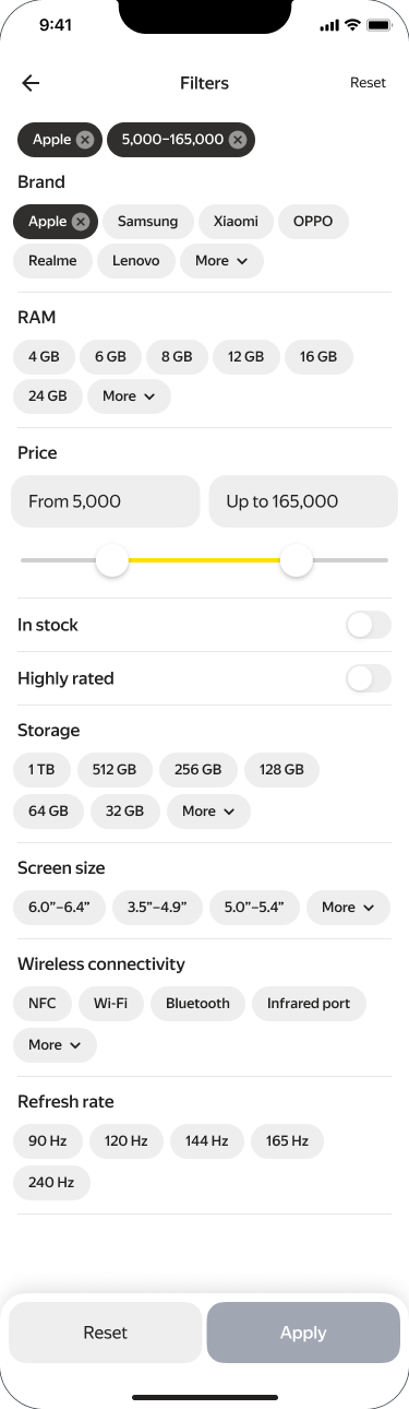
Quick controls cover common choices beside the products, while the full form brings together brand, price and technical attributes. This gives simple requests a short path and more demanding searches a detailed one. Shoppers can adjust a single criterion without opening the complete form, then move into the form when the category calls for additional detail.
Match the selector to the attribute
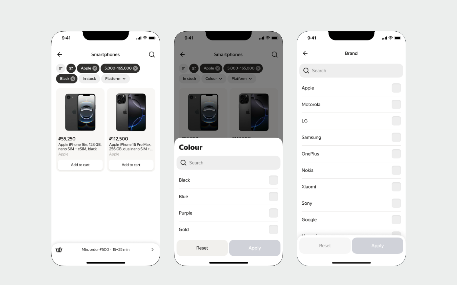
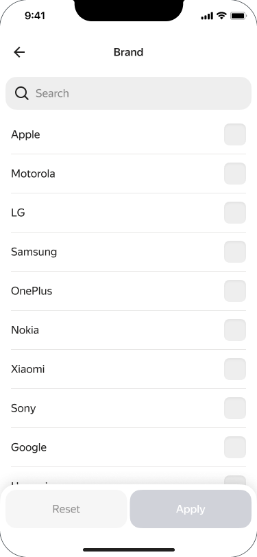
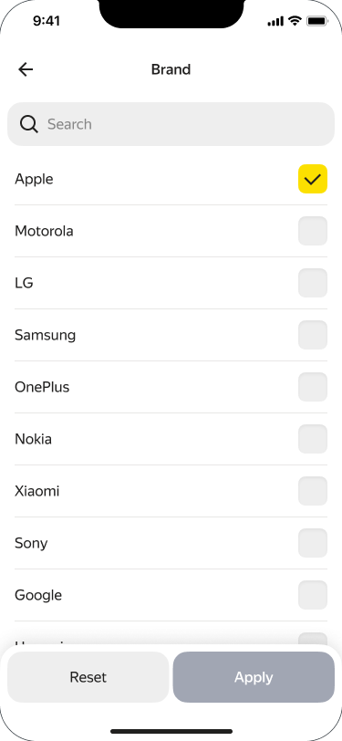
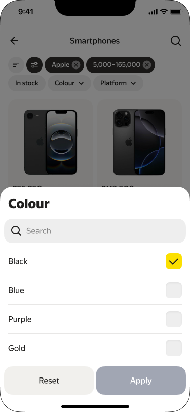
A long brand list benefits from search; a short colour choice fits a bottom sheet. Selection and review states make these different controls part of one consistent journey. Matching the input to the attribute keeps the catalogue compact while still exposing the available options. The detailed form remains the place to review choices across attributes.
Keep the current criteria visible
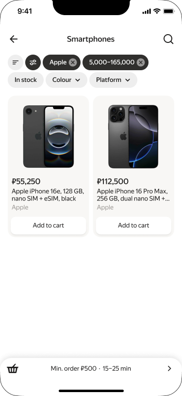
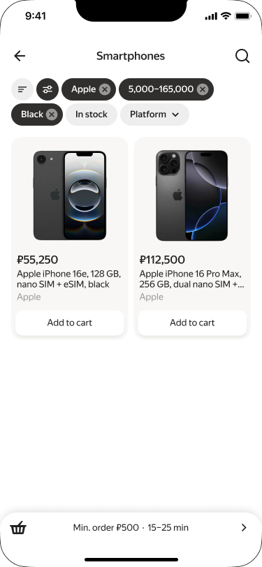
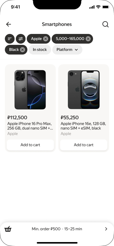
After applying choices, shoppers return to the matching products. Chips above the results show the current criteria. This connects decisions made inside the form to the catalogue they produced: the selection does not disappear into another screen while the shopper continues comparing products. The resulting list becomes the starting point for the next refinement.
Complete the journey with sorting
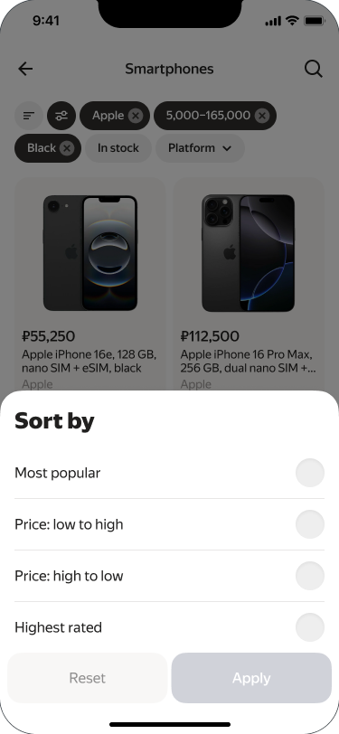
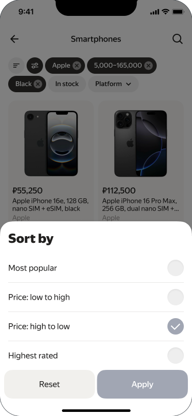
Sorting changes the order of matching products while retaining the selected filters. A dedicated bottom sheet shows the available options and the selected value. The screens follow the complete transition: open sorting, choose price from high to low and return to the reordered list. Navigation, filtering and sorting therefore form one continuous browsing flow.
Outcome
An A/B test showed a 4% relative increase in add-to-cart conversion versus the control group.